 |
| See Student Work Here |
Op
Art
Objectives
To
understand how color relationships impact the way we "see"
color.
To
explore different contexts for art-making--specifically, art in the
public arena.
Project
Overview
Your
challenge is to plan and execute a proposal design for a public art
mural (or other form of public art) using
the
principles of color theory.
Reading
and References for Study
Reading:
Chapter 4 in Becky Koenig’s Color Workbook. Pages 54-73.
Artists:
Sonia Delaunay, Josef Albers, Richard Anuszkiewicz, the Anonima
Group, Victor Vasarely, Bridget Riley
Movements:
Orphism, Optical Art, Minimalism
Vocabulary
color
interaction, simultaneous contrast, successive contrast, optical
mixtures, complementary vibration, bezold
effect,
actual color transparency, simulated transparency
Materials
Open
Process
Preliminary:
1.
Before coming to class, review the thematic concept of Art For
Hire as found on the ArtCORE website. Also read the
discussion on Albers & Relational Color for Unit VI and
the assigned section from your textbook.
2.
Check out the Phoenix Public Art Program site on the web.
Exercise:
The
Phoenix Art Museum is seeking proposals for their Artists’
Initiative: Temporary Public Works Project. They want an Op
Art-style work in a public location within the city for the purpose
of community enrichment.
1.
Choose a building, overpass, sidewalk, or other public feature that
interests you. Take pictures of the site from multiple
perspectives, for use in making preliminary drawings. The Mill (of
Mill Street) would be a good choice.
2.
Research the site: who owns it? What is it used for? Who uses it?
What is its history? Why are you interested in the site? Do
some brainstorming (writing) on your thoughts about the site and why
you chose it.
3.
Making several thumbnails, experiment with the following color
studies in order to prepare for the Op Art mural or public work
you will be proposing for the museum.
Thumbnails:
Color
Interaction Studies:
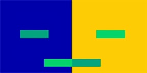
a) Using the concepts of color interaction, take one
color and place it on two different grounds to make it appear to
be two different colors.
b) The proportion should be approximately 6” x 6” or 5”
x 5” square for the ground and a 1” x 1” square or a 1”4”
stripe for the color to be changed.
The point is to make the same color look radically different by manipulation of various colored grounds. Try many possibilities with colored paper until you get a major color change.
The point is to make the same color look radically different by manipulation of various colored grounds. Try many possibilities with colored paper until you get a major color change.
Remember
to make the grounds as different as possible. Differences in hues
(opposite hues), saturation, color
temperature, and/or value are needed to truly change the color you have chosen.
temperature, and/or value are needed to truly change the color you have chosen.
2. Make two different colors appear to be the same color. (1 thumbnail)
a) Pick two slightly different colors.
 The
colors may vary in value, for example, a lighter and a darker
orange. They also can be slightly different in hue, a green BG
and a bluer BG, for example. The two colors might be slightly
varied saturations of one color, for example, blue and a tone
of blue.
b) Now pick two different grounds to try to equalize the two
colors that you have chosen.
Try
to use the three principles of color interaction to implement this.
Example: If you are using a lighter and darker value of one
color, you can put the light color on a light ground and the dark
value on a dark ground. Also use subtraction and/or complementary
reaction if necessary.
c) Save an extra piece of each color used and place it as
shown with your study. This will indicate where each color is
placed and indicate the color differences.
1. Analogous Optical Mixture (1 thumbnail)
a) Pick a pair of analogous or almost analogous hues (by
skipping the in-between hue) from the color circle. Example: Blue
and BG or red and violet.
The
colors should be keyed to the same value as closely as possible.
The value match will create a better optical mixture.
b) Make a pattern of stripes, dots, a grid or any pattern
using equal surface area for each of the two colors. This will
let them blend visually when viewed from a reasonable distance.
This visual mixture is the opposite of the analogous
mixture.
a) Pick any dyad or complementary pair. Make sure that the
colors of the dyad are high in saturation.
b) If you wish, use the same pattern(s) from the analogous
optical mixture exercise and replace the analogous pair of colors
with the dyad.
You
should notice a strong movement or vibration if you look at this
study.
If
you view it from across the room, you will notice a change in
contrast and possibly a neutral color.
Bezold Effect Study (1 thumbnail)
1. Plan a geometric pattern that uses four or more
colors.
2. Choose two different grounds for your studies that
substantially change the appearance of all the colors in
the study. Try to choose grounds that are opposing light
and dark values, complementary hues, or colors that are high and low
in saturation.
The design should appear to be very different chromatically
from one ground to another.
Make sure to let the colors in each design interlock so that
the change in interaction between them can also be
detected.
Simulated
Transparency Study (1 thumbnail)
1. Choose at least four pairs of colors that you want to overlap
in a design. Make sure each pair is a different type of
color combination.
2. Design an image using geometric or organic shapes that
overlap.
Pick colors that represent the in-between color for each of
the four sets of parent colors that you have chosen.
3. Where the components of your design overlap, place the
appropriate colors to simulate the illusion of
transparency.
The ground color should be dark or neutral to accentuate the
illusion of transparency.
4.
Make an additional 5 thumbnails that combine multiple fusions of your
previous experiments.
5.
You will present your basic ideas to a "selection committee"
(3-4 other classmates).
From your 5 thumbnail sketches, choose one that you feel is the
best idea. Put all the thumbnails in your notebook for
reference.
 6.
From your chosen thumbnail, make a larger sketch (one to a sheet of
biology paper) that expands on your thumbnail idea. Add detail,
use color, and think about what media your final project will be
produced in. Practice with that media on this sketch. It may
help to make this sketch directly onto a printed picture of
your site.
7.
Evaluate. Step back and consider the sketch objectively. As you find
areas of deficiency, go back and rework to solve any design
problems you detect.
8.
Begin on final. Use the sketches as models for the final piece. When
making the piece, allow yourself to deviate from your plan if
you discover something new and exciting. Your challenge here is to
keep the process open to growth and expansion while still
benefiting from the extensive planning you have already done.
9.
Hand in a proposal packet that includes:
a) 1-page description of your proposal, explaining key ideas
and how they relate to the site.
b) The final proposal image.
Critique
Questions for Suggestion
1.
Can you describe this work using at least 3 vocabulary words from
this unit?
2.
What is the initial "feeling" or emotional response you get
when first viewing this work?
3.
What color relationship strategies were employed by the artist?
4.
Does the research presented help the viewer to understand the intent
of the artist and the significance of the
work?
5.
Does this work successfully address the challenges of doing art in a
"public" setting?
Notebook
Checklist
□ Cleanliness and Organization
□ Turned in on Time
□ Cleanliness and Organization
□ Turned in on Time
□ Discussion
Page on Albers & Relational Color
□ Project
Objectives
□ Concept
Page on Art for Hire
□ Vocabulary
□ Vocabulary
□ Research
□ Thumbnails
□ Proposal
package


No comments:
Post a Comment